
I thought before jumping ahead into more complex styles, I should really give English scroll a try. It really appealed to me and seemed relatively simple, or so I thought. After studying numerous images on line, I drew a simple design and quickly cut it without knowing the proper way to go about it. But if you’re not making mistakes you’re not learning!
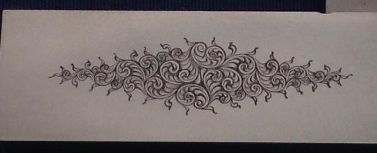
I was a little proud of this “work of art,” but then asked Ken Hunt on Instagram what he thought of it and I was so happy he replied, but my glory quickly faded when he kindly explained it to me it was not proper English scroll.
He sent me a drawing of my design pointing out my mistakes and giving me some good advice. It took me several hours to get it redesigned to where it looked correct (but without a master looking over your shoulder you’re always wondering if you’re on the right track.) I was determined to figure it out and cut until I got it right!
Ken continued helping me and I wouldn’t have figured it out without him! Unfortunately, (or maybe fortunately) I kept making mistakes, but I learn better by making them, that way I know what I shouldn’t do next time.
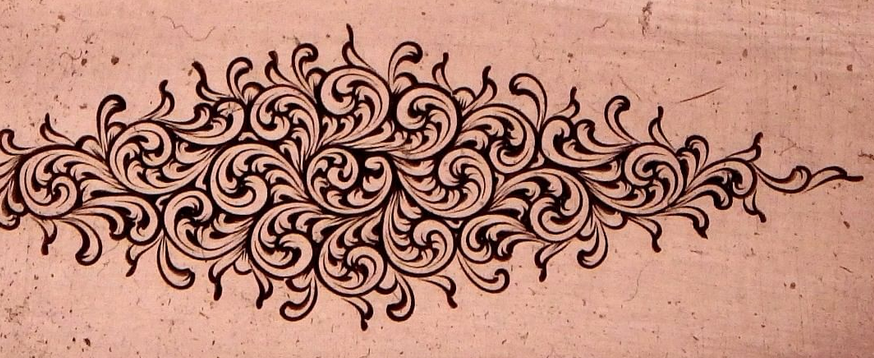
In my second attempt (image above), I had several scroll heads growing toward the origin, which may be okay in other styles, but not in English. There should be flow that radiates out which gives English Fine Scroll it’s simplicity and elegance. Get it wrong and it just looks like something is amiss, but you’re not quite sure what it is. The above image is a good example of that.
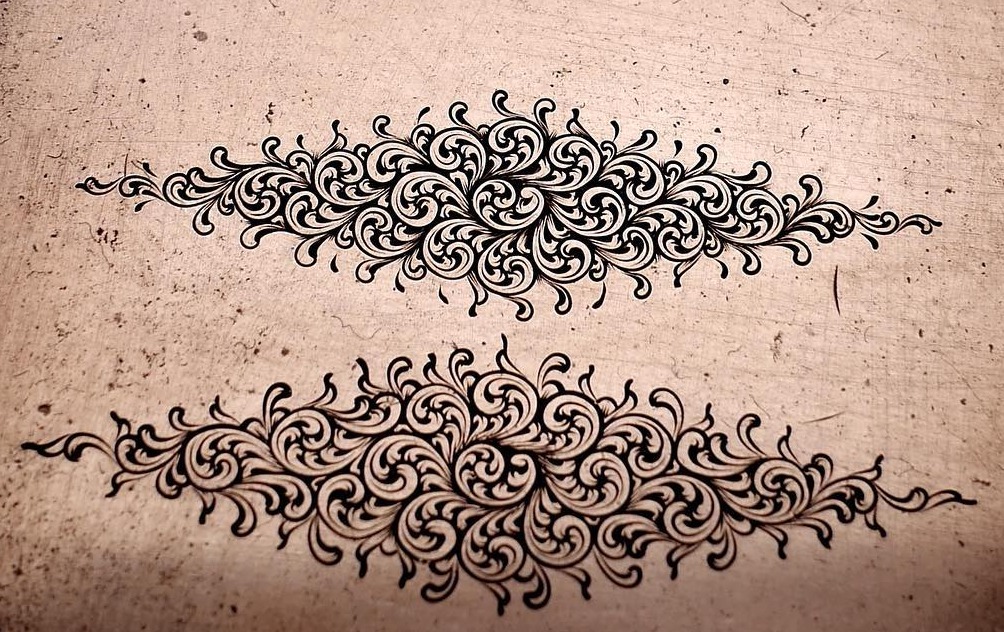
I redesigned again, correcting my mistakes, and it finally started to look like something!
Shading was also somewhat puzzling to me, I was afraid to cut it too heavy but you need to cut it heavy enough to make it pop. You can see the difference the proper flow and shading makes in the top scroll in the image above.
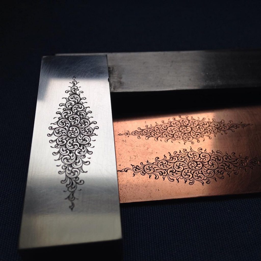
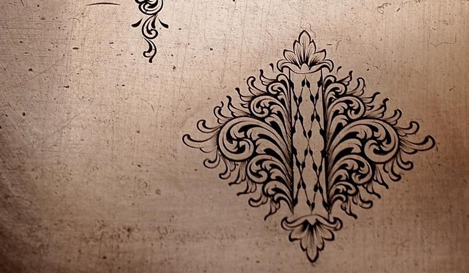
I was getting pretty happy with the results and cut a slightly smaller design in mild steel.
Ken pointed out that my outside leaves needed to be more random, closer together, and should have a flow to them. They also needed to be roughly the same size as the inside leaves.
I was feeling good about the progress I was making, but there seemed to be no end to my errors! I kept correcting them one at a time and moving forward.
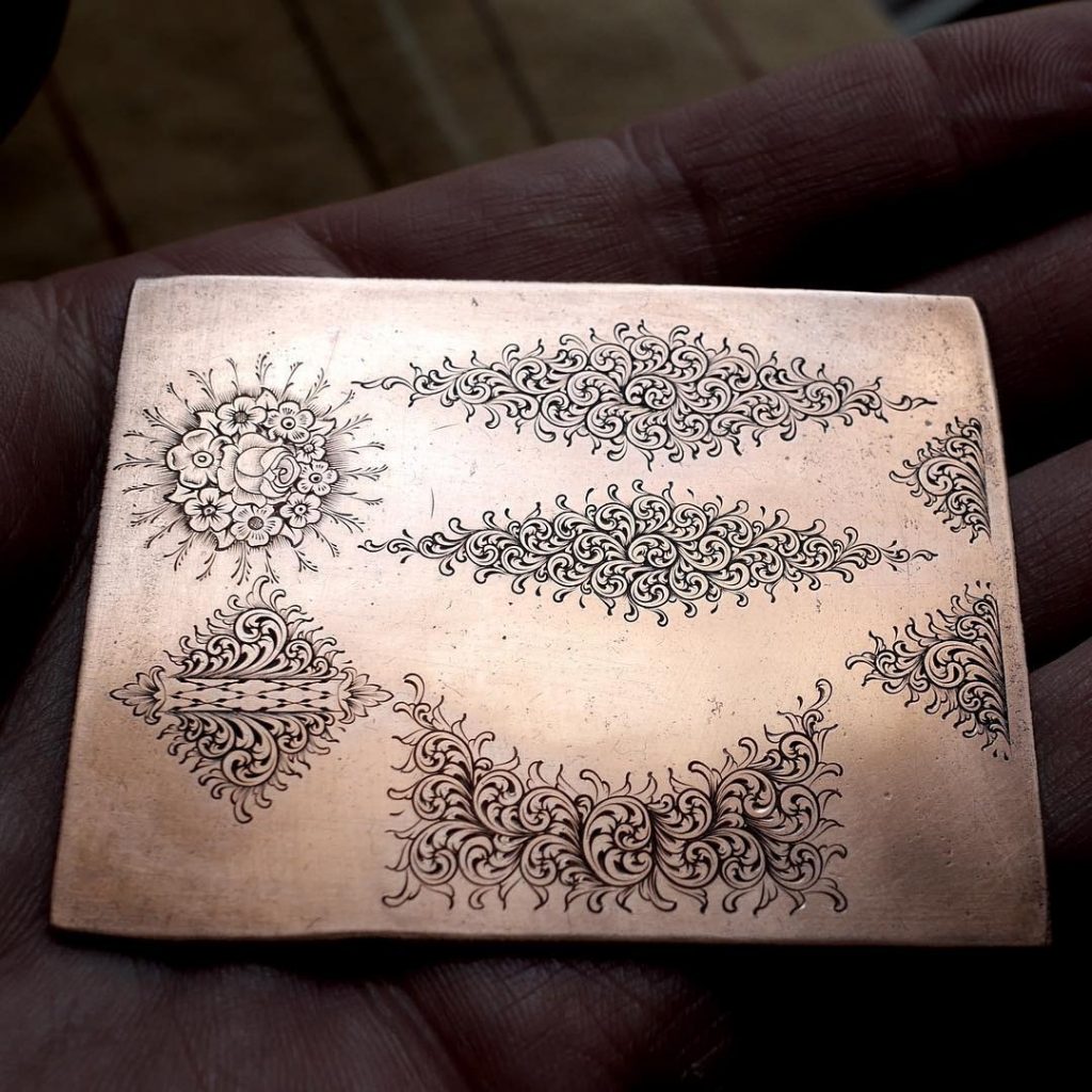
I made the leaves closer together (but they probably could be more random). At this point I felt I was getting the gist of it, and with a little more practice I can be satisfied with it. I engraved a few more designs to make sure though.
Ken says, “Every engraver puts a different touch to their flowers and scroll , like identifying handwriting . With viewing some old guns people show on line you may spot some values to help.”
I wanted to get the basics of Fine English Scroll before adding my personal touch to it. I certainly don’t want obvious mistakes to be my signature. : )
More practice…
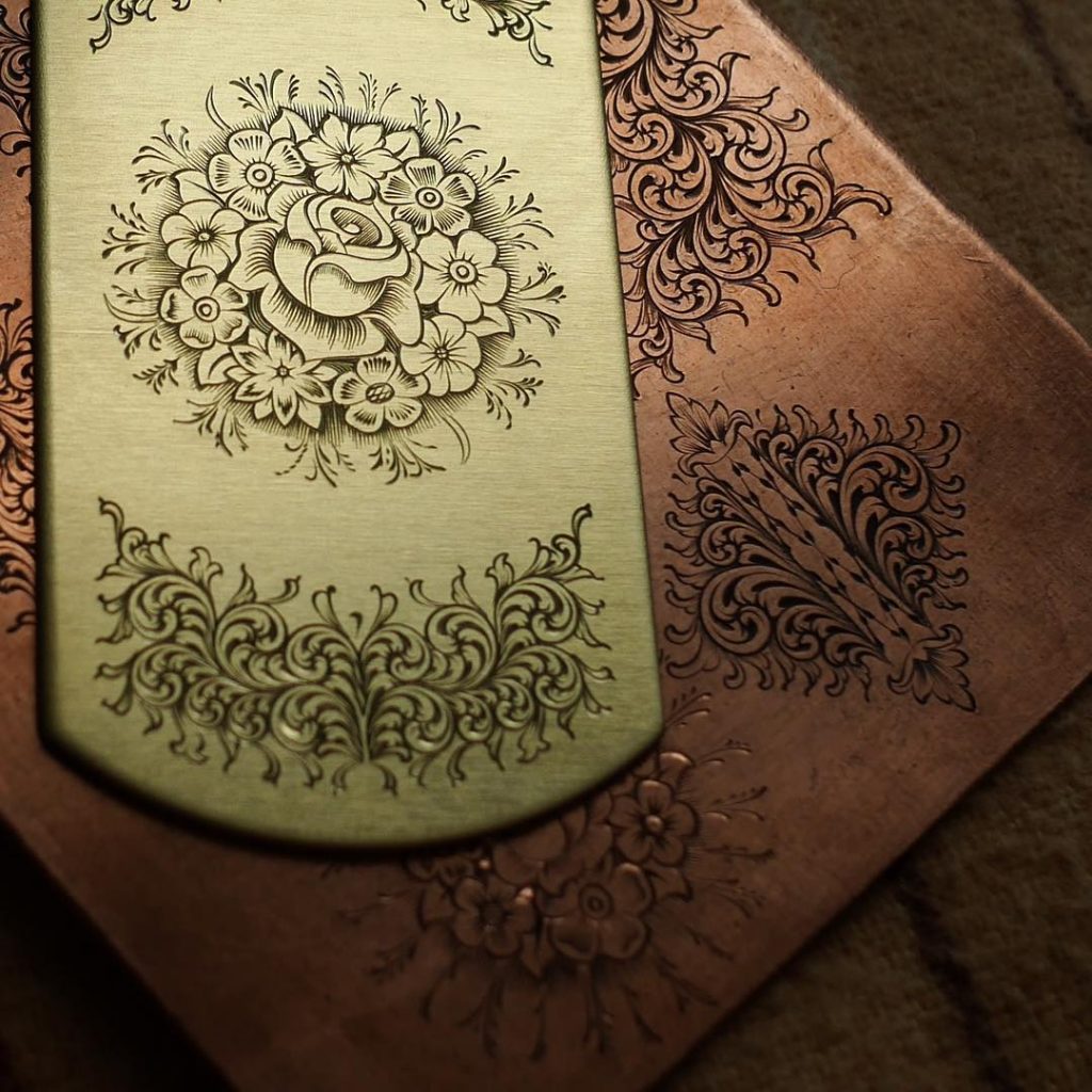
There are more elements in Fine English Scroll besides the scroll itself. There are flower bouquets and rondels that could be incorporated into the design. I wanted to give those a try as well. They proved to be just as challenging as the scroll.
My first attempt at the bouquet was not very good. The flowers and shading were okay, but the ferns are too long and needs to be more random and organic.
I tried cutting both. The bouquet turned out better but needed more shading around the flowers. I made the ferns shorter and that did help in the overall look of the bouquet.
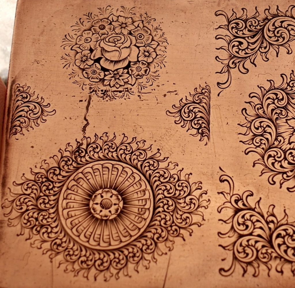
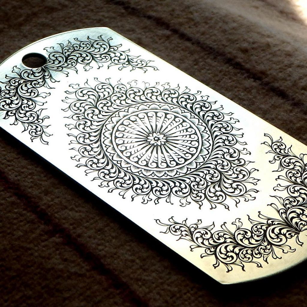
The Rondel, or rosette as I thought it was called, was another fail indeed. In my mind it was just a round rosette that was supposed to look cool, but time and time again I was proven how little I knew about English scroll.
Ken is honest but very direct with his suggestions, “Your one looks like golf clubs and not like elongated scroll.”
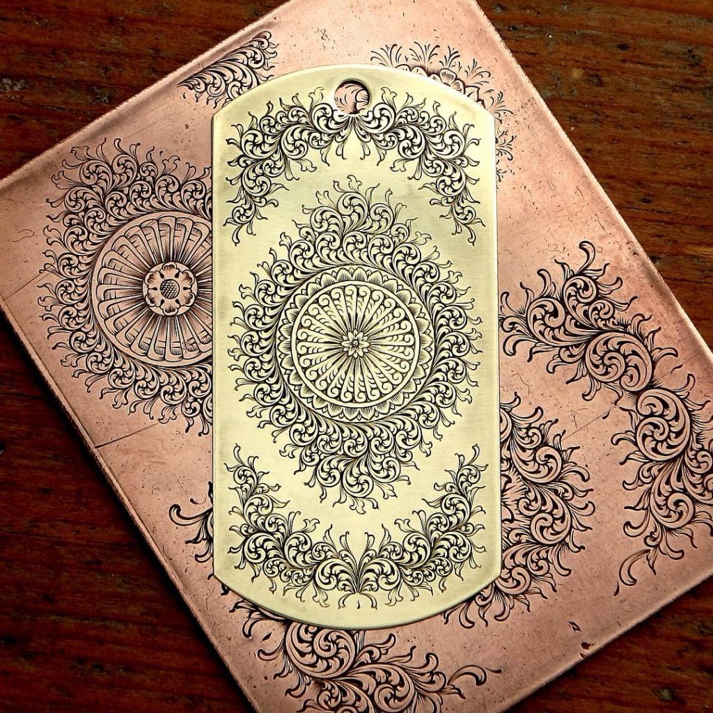
I went back to work on the new rondel design after studying Ken’s sketches and several images I could find of shotguns engraved by Ken and other English masters. I would have never gotten this far without his help!
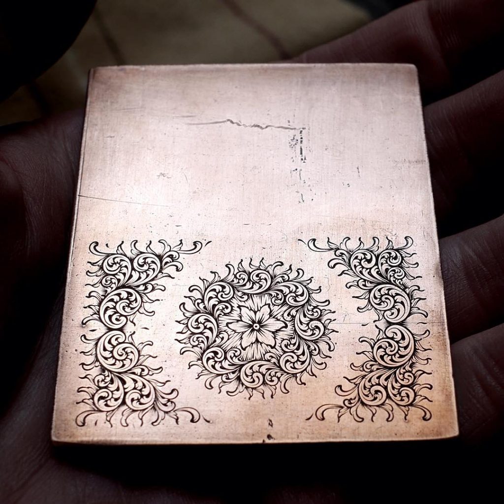
I engraved another bouquet before addressing the rondel and was finally able to get everything right, even though the scroll could use some mini scroll feelers in between the outside leaves.
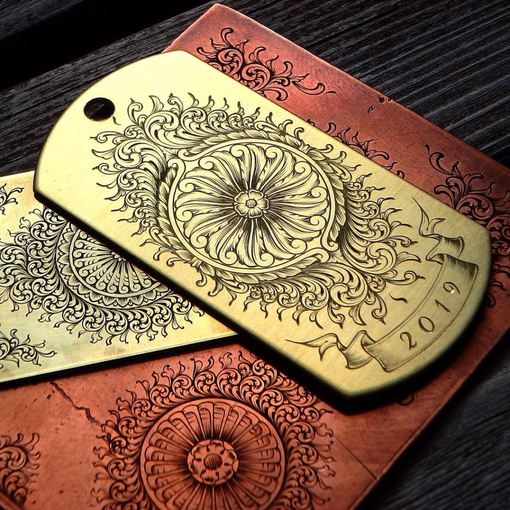
After more scroll practice and another shot at the rondel, everything started coming together and looking more and more like the English scroll. I also noticed I was getting a little faster at it, even though it was not my goal. I purposely made bigger designs to get as much practice as I could and make as many mistakes as I could. (not on purpose)
At this point I was very happy with the scroll, but the rondel still looked like it could be better.
A friend was able to find a book called “English Fine Scroll construction and application” by Marcus Hunt (Ken’s son) , and after reading it I realized my cuts were totally wrong. It’s supposed to be a teardrop plunge cut, and I was cutting it as though it was a Western bright cut scroll.
I did a full day of practicing making that cut, but it proved to be harder than it looked. Previously, I used cold blue to darken the cuts but if done properly it will not be needed. Below is another attempt at fine English scroll, this time making proper cuts and no cold blue.
It’s going to take time to really master this style. I have learned a lot from this exercise and will continue to keep working at it. I hope this post has been informative to the beginner engravers out there, and would like to encourage you to not give up but keep pressing forward!